Mario Sanchez Carrion
I am a math tutor currently helping middle and high school students master common math concepts, and getting them prepared for the SAT and ACT tests.
I hold degrees in Industrial Engineering and an MBA. I am also a computer programming enthusiast, especially interested in data analytics using Python, SQL and R.
I previously worked in international marketing and product development for Fortune 500 companies, for more than 25 years.
👋 Contact me at mario@mariosanchez.org.
JavaScript Photo Gallery
An Instagram-inspired pleasantly styled photo gallery rendered on demand
Made with: JavaScript
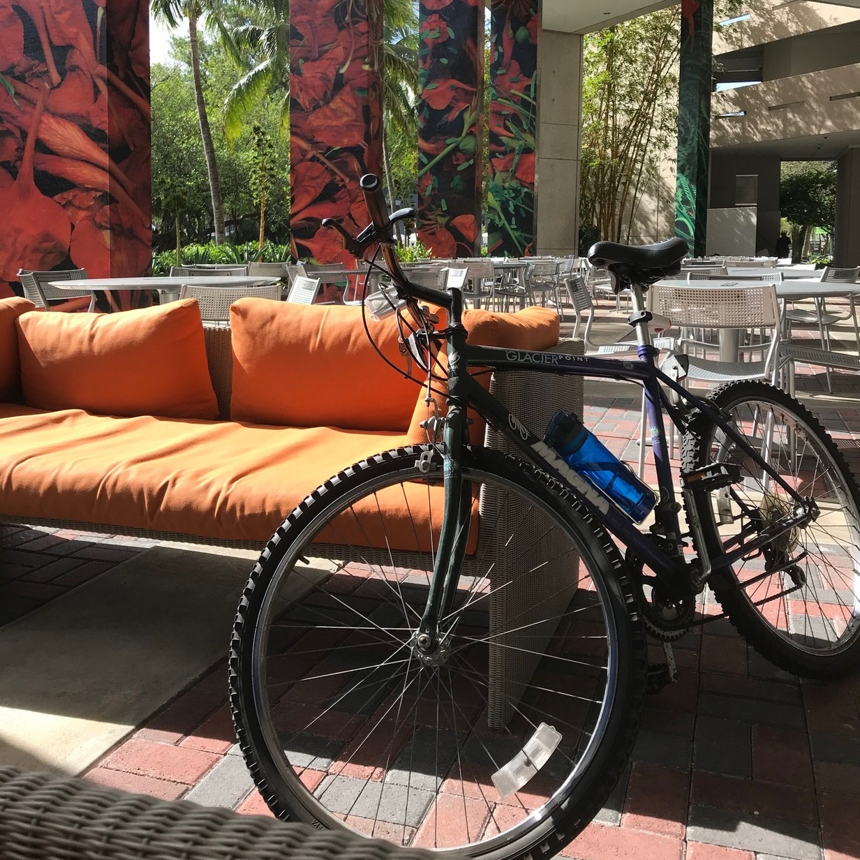
I wanted to post a few pictures from my trips and other activities here in the site. Looking around the web for ideas I settled on a simple square format for the pictures, with a subtle frame and a gray transparent rectangle for the description placed at the bottom of the photo:

These are the style declarations for the photos:
img.gallery {
  padding: 4px;
  border: 1px solid #ccc;
  margin-bottom: 1em;
  margin-right: 2%;
}

.picbox {
  display: inline-block;
  margin: 0.5em;
}

figure {
  margin: 0;
  position: relative;

}

figcaption {
  font-size: 0.85em;
  line-height: 1.5;
  color: #fff;
  background: rgba(19,43,102, .50);
  bottom: 0;
  position: absolute;
  margin-bottom: 33px;
  margin-left: 5px;
  padding: 0.6em;
  box-sizing: border-box;
}
Since I’m using a mobile first approach, the style declarations above apply to small screens. For screen sizes 769px and up I created a media query slightly modifying the size of the pictures:
@media (min-width: 769px) {
  img.gallery.medium {
  width: 300px;
  }
}
I placed the pictures in my img folder and then created a JSON file with the url and description of each picture. Every time I want to add a picture to the gallery, I add a new member at the top of the object.
Finally, I created the following JavaScript script that renders the images in the gallery. The script uses the fetch() method to pull the information from the JSON file and then parses it to convert it into a JavaScript object (in this case an array). It then maps over the array and builds the HTML elements that hold the gallery and the pictures. Once the map function is done, the HTML is placed in the proper place in the photos HTML template via the document.getElementById() method.
By using a small script we avoid having to hard code the HTML page every time we want to add a picture.
To see the gallery in action click here.
© 2025 Mario Sanchez Carrion